It’s Friday, and Friday means fun!
So on a Friday, I’m sharing a quick craft that actually I happen to LOVE in my home. I’m also sharing how it turned out in a way I did not care for, and how I fixed it. Cuz life is about mistakes.
That’s why we’re awesome. And therefore, we need to have an awesome family sign!
**I cut my stencils on my Silhouette, but you could use any cutting machine or even plain plastic stencils. Or hand-letter, if you’re skilled at that! (I am not.)

My husband has this “thing” about the word awesome. He will almost always buy a t-shirt (his favorite addiction outside of video games) if it refers to awesome. His favorite catch phrase to annoy me with is “that’s because I’m AWESOME!” = though admittedly, he typically says that in an adorable, self-deprecating way when he’s been caught either forgetting something or doing something wrong. 🙂
So when I found a clearance wooden sign at Big Lots with some silly phrase that would never pertain to us, I figured I could repurpose it for my hubby’s awesome affiliation.

I would show you what I converted, but oops! I forgot to take that pic. Suffice to say, it was a wooden sign saying Yada Yada Yada. Here it is after I spray painted it black. I was going for a faux chalkboard effect.

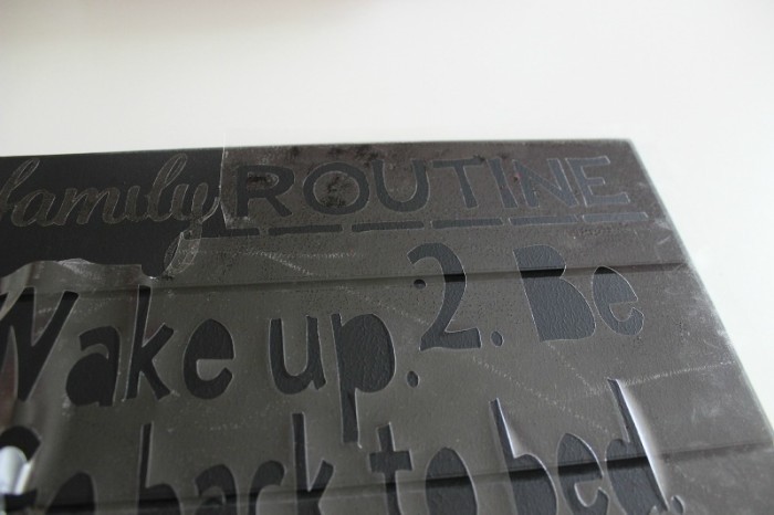
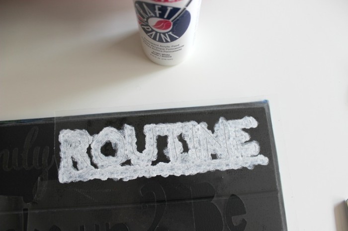
I used some clear contact paper for my stencil, and ran it through a design I created on my Silhouette. I actually THOUGHT it was white vinyl, and figured I could use the vinyl letters if the stencil back-fired. It was only after I cut it and started weeding (the process of separating letters and images from the excess) that I realized it was clear. So stencil it is! You can see above, I went two different routes. The vast majority of the sign, I used the excess to make the actual letters the stenciled part. With only the word “family”, I flipped it, laying down the word itself and painting around it. (More about that in a minute.)

I used the cheap little sponge daubers and brushes you can get by the bundle at Michaels, and white acrylic paint.

I basically dabbed repeatedly in a messy-ish method, since my goal was to look like chalk.

Now here’s where the big ICK happened. I had done all the white lettering, with the intent of making my “Awesome” addition stand out in a separate paint color. However, after looking at my all the white, I decided I made a big mistake changing up both the font and the way I painted the heading of “Family Routine”.

Ick!!
So I repainted that section black and started again. I had to redo the font in my Silhouette program and re cut it to match “Routine”.

It turned out that the “painting around the word” trick worked better for my feature word! (And I’ve decided its simply my extreme pickiness that I’m regretting the white dots around it. Se la vie!)
My husband burst out laughing when we first saw it, and we get lots of compliments on it. Nothing wrong with a jolt of over-confidence now and then!
What motto does your family adopt?


I love linking up at these parties!